
Menu
<template>
  <PeachyMenu.Menu>
    <PeachyMenu.Trigger>
      Menu
      <EllipsisSvg />
    </PeachyMenu.Trigger>

    <PeachyMenu.Target>
      <PeachyMenu.List>
        <PeachyMenu.Item>Menu item</PeachyMenu.Item>

        <PeachyMenu.Menu>
          <PeachyMenu.Trigger>
            Submenu
            <ChevronSvg />
          </PeachyMenu.Trigger>

          <PeachyMenu.Target placement="right-start">
            <PeachyMenu.List>
              <PeachyMenu.Item>Submenu item</PeachyMenu.Item>

              <PeachyMenu.Item disabled>Disabled submenu item</PeachyMenu.Item>

              <PeachyMenu.CheckboxItem v-model:checked="checked">
                <div class="checkbox" role="presentation" />
                Checkbox
              </PeachyMenu.CheckboxItem>
            </PeachyMenu.List>
          </PeachyMenu.Target>
        </PeachyMenu.Menu>

        <PeachyMenu.Separator />

        <PeachyMenu.RadioGroup v-model:value="radioValue">
          <PeachyMenu.Label>Label</PeachyMenu.Label>

          <PeachyMenu.RadioItem :value="0">
            <div class="radio" role="presentation" />
            Radio Option
          </PeachyMenu.RadioItem>

          <PeachyMenu.RadioItem :value="1">
            <div class="radio" role="presentation" />
            Radio option
          </PeachyMenu.RadioItem>
        </PeachyMenu.RadioGroup>
      </PeachyMenu.List>
    </PeachyMenu.Target>
  </PeachyMenu.Menu>
</template>.peachy-menu__target {
background: none;
border: none;
}
.peachy-menu__list {
list-style: none;
padding: 0.75rem 0.5rem;
margin: 0.5rem;
display: grid;
gap: 0.25rem;
border-radius: var(--border-radius);
background: var(--bg);
border: 1px solid var(--border);
box-shadow: var(--shadow);
}
.peachy-menu__item {
cursor: pointer;
}
.peachy-menu__item[aria-disabled="true"] {
cursor: default;
opacity: 0.5;
}
.peachy-menu__item,
.peachy-menu__label {
border: none;
background: transparent;
border-radius: calc(var(--border-radius) / 2);
height: var(--button-height);
padding: 0.75em;
font-size: 90%;
color: var(--text);
line-height: 1;
transition: background 0.25s;
}
.peachy-menu__item:hover,
.peachy-menu__item:focus-visible {
background: var(--button-hover-bg);
}
.peachy-menu__sub-trigger {
display: flex;
align-items: center;
justify-content: space-between;
gap: var(--gap);
}
.peachy-menu__sub-trigger:has(+ :popover-open) {
background: var(--button-bg);
}
.peachy-menu__label {
opacity: 0.7;
font-size: 85%;
text-transform: uppercase;
padding: 0 0.75em;
height: 1.25rem;
}
.peachy-menu__separator + .peachy-menu__label {
margin-top: 12px;
}
.peachy-menu__separator {
width: 100%;
margin: 8px 0 8px 0;
border: 0;
border-top: 2px solid var(--divider);
}
.peachy-menu__checkbox-item,
.peachy-menu__radio-item {
display: flex;
justify-content: flex-start;
align-items: center;
gap: var(--gap);
}
/* ===== Animation ===== */
@media (prefers-reduced-motion: no-preference) {
.peachy-menu__target:popover-open {
animation: FadeIn 0.25s;
}
}
@keyframes FadeIn {
from {
opacity: 0;
}
}
/* ===== Checkboxes and radios ===== */
.peachy-menu__checkbox-item > .checkbox,
.peachy-menu__radio-item > .radio {
position: relative;
width: 0.6rem;
height: 0.6rem;
border: 1.5px solid var(--brand-color);
}
.peachy-menu__checkbox-item > .checkbox {
border-radius: 1px;
}
.peachy-menu__radio-item > .radio {
border-radius: 100%;
}
.peachy-menu__checkbox-item[aria-checked="true"] > .checkbox {
border: none;
background: transparent;
}
.peachy-menu__checkbox-item[aria-checked="true"] > .checkbox::before {
position: absolute;
content: "\2713";
inset: 0;
color: var(--brand-color);
line-height: 1;
font-size: 0.8em;
font-weight: var(--fw-bold);
transform-origin: center;
transform: scale(1.2);
}
.peachy-menu__radio-item[aria-checked="true"] > .radio {
background: var(--brand-color);
}Anatomy
<template>
  <PeachyMenu.Menu>
    <PeachyMenu.Trigger />

    <PeachyMenu.Target>
      <PeachyMenu.List>
        <PeachyMenu.Item />
        <PeachyMenu.Label />
        <PeachyMenu.CheckboxItem />
        <PeachyMenu.Menu />
        <PeachyMenu.Separator />

        <PeachyMenu.RadioGroup>
          <PeachyMenu.Label />
          <PeachyMenu.RadioItem />
        </PeachyMenu.RadioGroup>
      </PeachyMenu.List>
    </PeachyMenu.Target>
  </PeachyMenu.Menu>
</template>

<script lang="ts" setup>
  import { PeachyMenu } from "typeach";
</script>A menu can be nested as many times as needed - this means if you make a component based on Menu, you can use it in any context and it will automatically adjust to be a menu or submenu depending on where you place it.
Structural notes
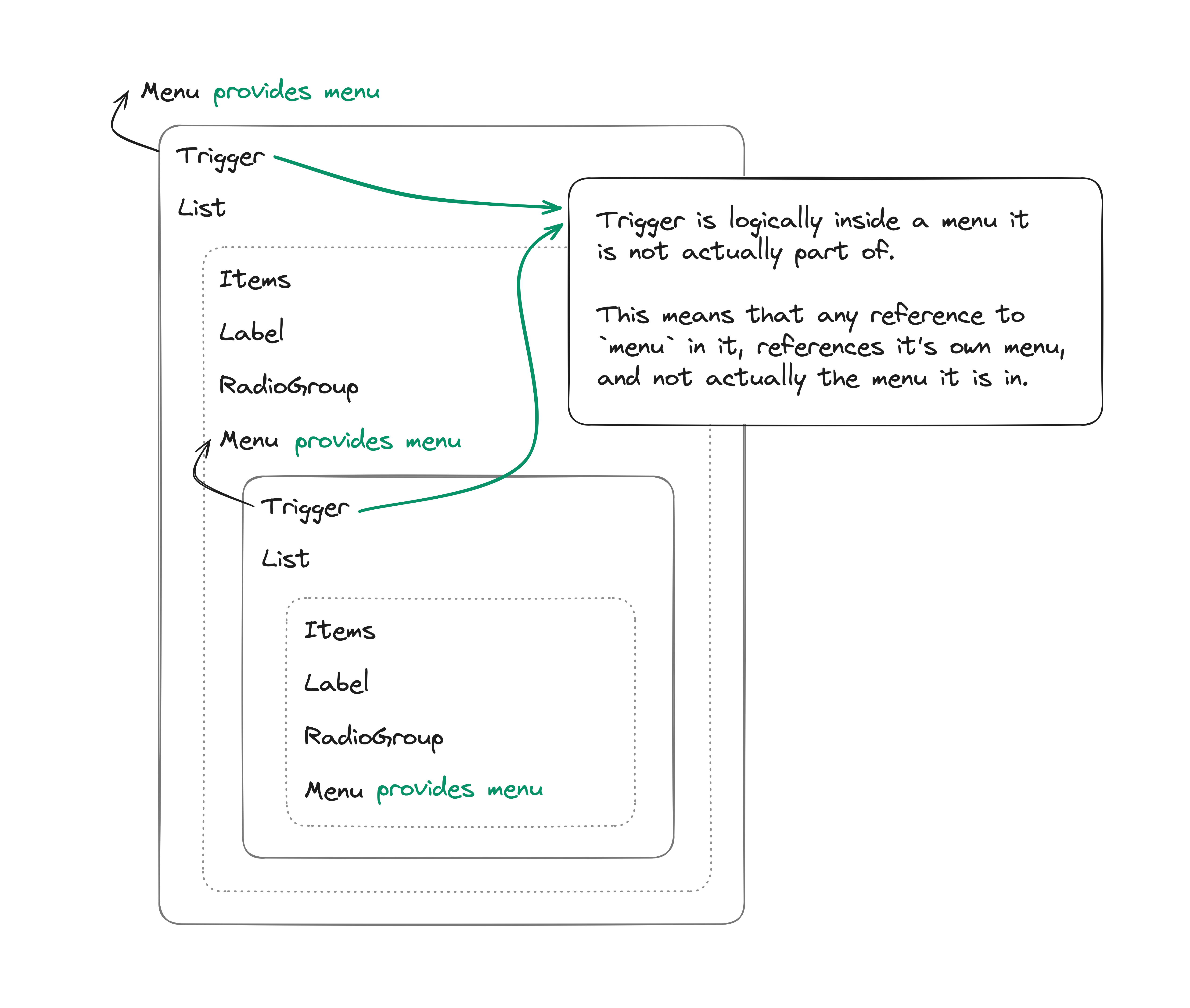
A trigger's menu reference is it's own menu.
Props & Emits
Trigger
Props
| Name | Type |
|---|---|
| disabled | boolean? |
Item
Props
| Name | Type |
|---|---|
| disabled | boolean? |
Emits
| @ | Payload |
|---|---|
| click | MouseEvent |
CheckboxItem
Props
| Name | Type |
|---|---|
| checked | boolean |
| disabled | boolean? |
Emits
| @ | Payload |
|---|---|
| update:checked | boolean |
RadioGroup
Props
| Name | Type |
|---|---|
| value | T |
Emits
| @ | Payload |
|---|---|
| update:value | T |
RadioItem
Props
| Name | Type |
|---|---|
| value | T |
| disabled | boolean? |
Separator
Props
| Name | Default | Type | Description |
|---|---|---|---|
| is | hr | string? | The is attribute for the dynamic root component. |
Styling
CSS Selectors
The root component (Menu) and RadioGroup are purely logical and have no elements to style, otherwise most of the child components follow our CSS classes convention, with a couple extras and exceptions:
.peachy-menu__itemis not just added toItem, but to any action items:CheckboxItemRadioItemTrigger(only when it's a submenu's trigger)
.peachy-menu__sub-triggeris added for a submenu's trigger..peachy-menu__triggeris added for the root trigger.
State selectors
| Selector | Description | For |
|---|---|---|
[aria-disabled="<boolean>"] | For disabled items. |
|
[aria-checked="<boolean>"] | For checked state. |
|
:focus | For the item currently selected. |
|
:has(+ :popover-open) | For a trigger with an open menu. |
|
[data-placement="<Placement>"] | The actual rendered placement of the menu. See Floating UI. |
|
Accessibility
Resources: APG Menu Button Pattern with focus, Material UI issue #33603 - see below for a more comprehensive list.
Keyboard interactions
| Key | Action |
|---|---|
Space or ↵ on the root Trigger | Opens the menu on the first item. |
↓ on the root Trigger when not disabled | Opens the menu on the first item. |
↑ on the root Trigger when not disabled | Opens the menu on the last item. |
↵ on a submenu's Trigger when not disabled | Opens the submenu on the first item. |
→ on a submenu's Trigger when not disabled | Opens the submenu on the first item. |
| ← when focus is inside a submenu | Closes the submenu and returns focus to it's trigger. |
↵ on Item, CheckboxItem or RadioItem when not disabled | Selects item, closes the menu and returns focus back to the root trigger. |
↓ on items or a submenu's Trigger | Moves focus to the next item. |
↑ on items or a submenu's Trigger | Moves focus to the previous item. |
Home on items or a submenu's Trigger | Moves focus to the first item. |
End on items or a submenu's Trigger | Moves focus to the last item. |
A-Z or a-z on items or a submenu's Trigger | Loops through items starting with the letter typed, or searches for the first item matching the search. |
| esc | Closes the menu and returns focus back to the root trigger. |
Hover and keyboard interactions are synced. E.g. in the example menu, if you hover over "Menu item", and then press arrow down - the focus will move to "Submenu".
Resources
APG - Menu Button Pattern
MDN
OpenUI
Hidde - On popover accessibility: what the browser does and doesn’t do
Melanie Sumner - Using the Popover API (accessibly)
Material UI - Issue #33603 Disabled menu items should be focusable with keyboard
Radix UI Primitives - Dropdown Menu
Headless UI - Menu